

I did the transition from Mapinfo to QGIS some time ago. And as any tool you are new to, some things are intuitive but other not much. The problem I had was that I need a thematic map to be updated every day. Of course I can upload a new table each day, but no one wants to do that. Instead I dig into the issue until I find a way to keep my map data updated, just updating the table. So the idea of this post is to explain how I solved this issue, hopping that it will be useful for you too.
I’m aware also that not many people know its way into QGIS, so I’ll go step by step in this procedure. I’m a Radio Frequency engineer, so I’ll put a daily example of my work; which is mapping eNodeB with their sectors, linking data to them and creating a thematic map that keep on with these changes. So let’s get started!
Gathering data
We will need two tables; the first one will have the data that will create the points on the map. Should have an unique identifier plus latitude and longitude columns as mandatory. In my case as I want to display cell data into a map, I need to include azimuth and some carrier information (later you will understand why). The second table should have all the data you want to display. Let me show you an example of both.
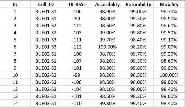
The first one will be the table I’m going to map:

The second one is the table with data. I have in both tables a unique ID that makes both tables easy to join:
QGIS can read several formats, but something I miss from Mapinfo is that it cannot read excel files directly (you have to add a plugin). The easiest way is to convert your tables into csv.
Loading a csv file into QGIS
Loading a csv file is quite simple. Just go to the top menu and select Layer > Add Layer and select “Add delimited Text Layer” option.

Although both are csv files there are slight changes in the way I load the table I’ll map and the table with data. Here is the table I’ll map:

There are a couple things you need to check. First if your data is like mine that comes from excel, you will have tab separated columns after save it as csv. The settings on “File format” and “Record and field options” I’m using here will do the trick to bring your data in the proper format and shape. Notice also that “Point coordinates” option is selected. That means that QGIS is expected that 2 columns will have latitude and longitude values. Also if your columns with coordinates have those names QGIS will select proper x and y field automatically (else, you will have to do it manually). As you see a sample of my data is in the bottom of the dialog box and the Add button is highlighted. That means that the table is OK to be imported into QGIS.
Before I pass to the map, let’s check how I’ll import the table with data:

There are few, but important differences from previous table. The “File Format” and “record and field options” remains the same. But I have selected “No geometry” so the program will not expect any coordinates to map. Another difference is that I have selected the “Watch file” option. This option basically tells QGIS that it has to check if the data containing in this file changes. Again, some of my data is displayed and the add button is highlighted so we are ready to go.
If everything went well, after we add the first table you will see something like this:
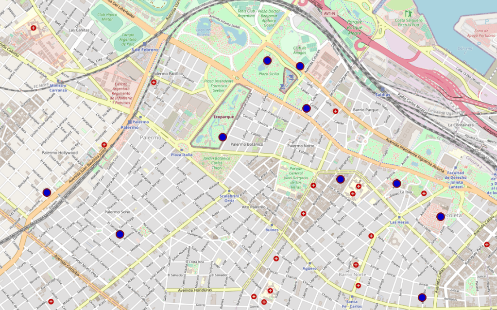
Now I have a beautiful map of my home town Buenos Aires with some dots on it that represent the cell sites. I’ll do some changes as I want the dots to be represented in another way, more useful to my activities. I mention this because you can also jump this step and go directly to the “Joining Tables” section, and skip this part.
Changing dots into pie-wedge graph
In this part I have to install a plugin. To install plugins we have to go to plugins and then click on manage and Install Plugins:

Once selected, there will be the following dialog box opened:

The plugin required for this task I have already installed and is the one called “Shape Tools”. If you haven’t got it installed, just go to the menu on the left and select “Not Installed” and browse the plugin by name. Then install it. Once you have installed it, the following tool box will appear in the menu bar:

Creating a pie wedge graph
Next to the doughnut is a little arrow. When you click it more form options are available:

Nothe that the map table (BuenosAires_map layer) is selected while I select the option of form. What I want to create is a “pie wedge” so I click on this option.
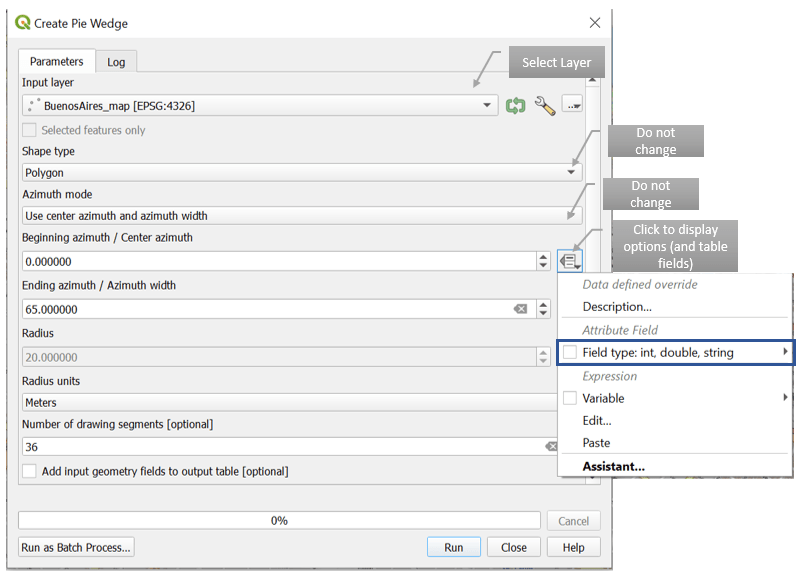
If you have not select any table before, you can select the table you want to graph in the “Input Layer” box.
Shape type is “polygon” and azimuth mode should be “Use center azimuth and azimuth width”. These are the default options and you should keep them that way.
Beginning azimuth / Center azimuth is the azimuth I have in the map table. In this case I’ll click in the drop menu in the right and browse the fields in my table to select Azimuth.
Ending Azimuth / Azimuth width is the width of the pies in degrees. I choose 65 which means 65 degree antenna.
For Radius you have 2 options. You can set a specific value or you make it variable. This field will take care of the size of the pie. In my case I have 2 carriers, so I want to show both. So one has to be larger than the other. In order to make it variable I will show you a petite trick:

In the same menu at the right choose “edit” so the Expression String Builder menu appears. In this way the pies will measure 160 if earfcndl value is 775 or will measure 120 otherwise. The last thing is to select radius Units which is kilometers by default, so I have change it to meters.
Then click Run:

Ok, now data is displayed as cell data, with azimuths and everything in shape. If you check in the left side of QGIS you will noticed that there is a new layer created that is called by default Output Layer. In this new layer the pie wedges are created.

Joining tables in QGIS
Now we have to join the map table with the data table. To do that right click on the Output layer and select “Properties”

Once the properties menu has opened, go to the right and select the “manage joins to other layers” option.
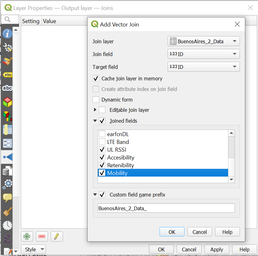
If you select the + button on green you can open the Add vector menu which is already displayed in my example. Here I have selected first the table to which I want to join (the table with data). Then Join field in both tables (that is the field that is common to both tables). And by clicking on Joined fields I will be able to select which fields I want to join to my map table.
lastly I select the option “custom field_name prefix” to easily identify my joined data. Click OK and then apply.
To check if everything goes well, without closing this dialog box select the option on the right “Manage Fields”

So in green you can see the joined data. Now we can do something cool. Let’s click on the brush icon on the right in the same menu (control feature symbology)

From all the options displayed select “Graduated”
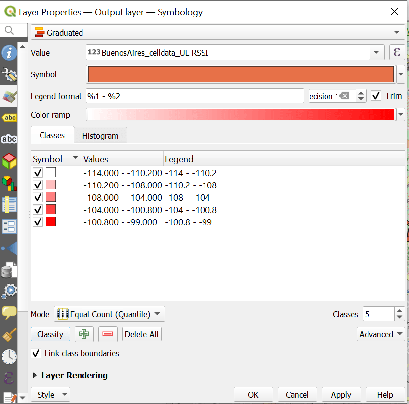
In my case, due the format of the field, I can map in a graduated map is UL RSSI. Check that the table is still the output layer, but I’m displaying the data table through the join I did before (how cool is that?). I just left everything default, then click “classify” then “apply” and finally “OK”.

We did it! Now the data on the map, which in my case are cells, and are colored according to a column (UL RSSI). Now we have to do the big test. Let’s change some values in the csv file and see if the map changes.
I have changed the value of UL RSSI on all sites to -112 dBm:

I have click save in excel (without closing it) and then click “update” on QGIS:

And it works! In case your map is not updated there could be some things missing. Remember to save the excel file and also to click update on the map. Also be sure that the option “Cache join layer in virtual memory” is not selected when you have joined the layers.
I hope this information was useful for you. But if you find it not very clear or confuse, please send me your comments.
Cheers!
Diego Goncalves Kovadloff

very well explained.
LikeLike