

Although this post is intended for RF engineers, I think that the information I’ll share here is useful for anyone that needs to show data points on QGIS. I’ll show two different ways on how to perform this task. Both work well, but the second one leave the door open to automation and a lot of customizations. Let’s say that the first option is the “Beginner” way and the second one is the “Goku-Pro” version (If you do not know who Goku is, please kindly go to another website). No more chatting, lets go into business.
Preparing your data
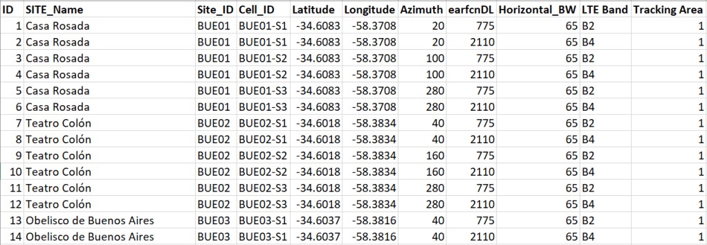
First of all we need to generate a csv file that contains at least latitude and longitude values. As I’ll be plotting cells, my data contains also information on azimuth, frequency and beam-width. My spreadsheet looks like this:
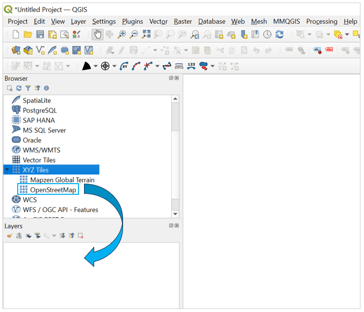
This is a comma separated standard file I just create in excel. Then we can head to QGIS and display this data as point on a map. But first lets get a map to display the data. We can easily add the “open street map” into a QGIS project by selecting XYZ Tiles option on the browser window, then selecting and dragging “OpenStreetMap” to the Layer Window.
Now that we have a map we can create the site layer. We can add a csv file by going to the top menu and scroll on Layer and select Add Layer > Add delimited text layer. Then the following window will pop out:
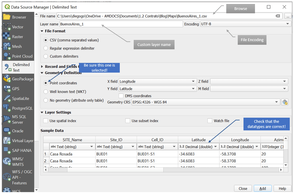
If you did work on the data on excel and save it as csv, the default settings of this window will work just fine. Another thing to notice is that if you have columns named “latitude” and “longitude” a tick on the point coordinates option will appear. If not, you can select the point coordinates option by hand and scroll down to your latitude column on the “Y Field” and for your longitude column on the “X Field” box. One last thing, be sure that the data type of your table is correct. This is important as if you plan to use the Azimuth column, it has to be an integer or a double type. You will now that you are ready to import your data once the Add button on the lower part of the window is selectable. We click on the Add button and we get our point displayed:
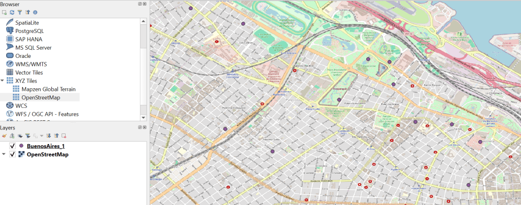
If everything went well you should end with a point layer and the open street map layer. My points are in purple, but as long as they are displayed on the map I’m OK. If your points are not displayed, verify that your point layer box is selected. If your points end up on the ocean or in a different location, check that your coordinates are well selected, and start the process again.
Displaying Cells – Beginner level
QGIS offers different ways to get this part done. One is with a plugin. I mention this process on a previous post named “Linking Data to QGIS“. But recently I found another method that is also straightforward. On the top menu select “Processing” and then “Toolbox”:
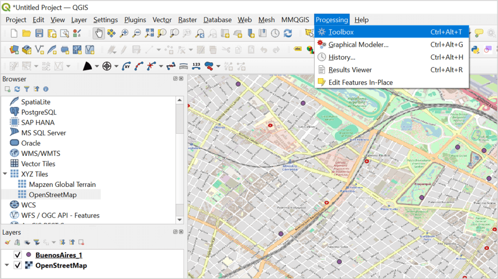
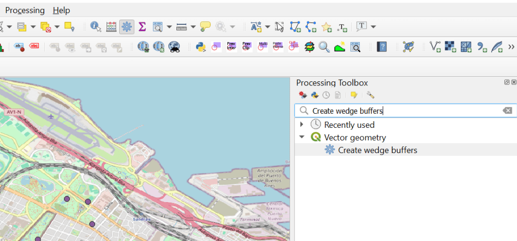
There are many options to get to the toolbox (like pressing Ctrl+Alt+T) but this one works well. Once toolbox is selected, a window of the toolbox menu will open on the right side of your screen. On the search area, type “Create wedge buffers”:
Then select the option with the gear icon in blue. You will get a pop out window were you will be able to select different options:
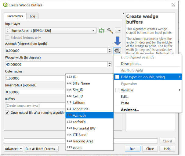
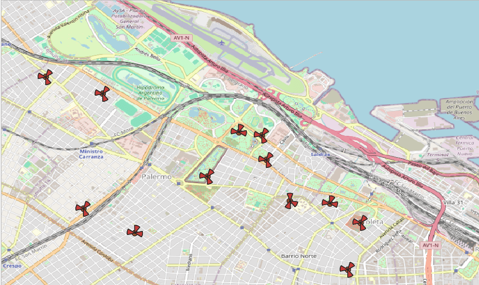
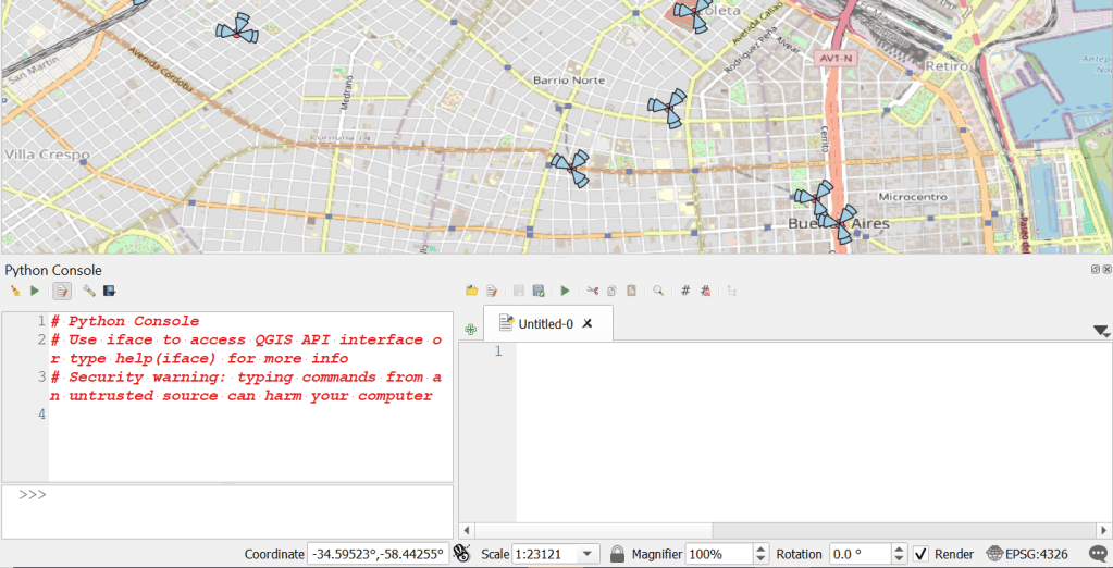
We start selecting the input layer that is our point layer. On azimuth we have a drop down menu that allows us to select the column that contains the cell azimuth. If you have an antenna beam width column you can also select it on the “Wedge Width” option. The last thing to do is to select the Outer Radius. This will set the “size” of the pie. To be honest I do not know in which units is set, but for me I have selected 0.0012 and for a 500 meters inter-site distance grid works well. Hit Run and you will end up with something like this:
Displaying Cells – Beginner (advance) level
Looks nice, but what if you have multiple carriers to display? In this case we need 1st to do a little change in our csv file. In my case I have an earfcnDL column that contains two different carriers (LTE carriers in this case). Notice that I have sorted the carriers in order; for each cell first appears the 775 carrier and then the 2110 carrier. I sorted it on purpose so the following method can work. Let’s go again to the Create Wedge Buffers window:
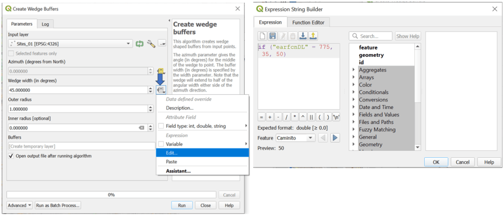
On the azimuth field select the azimuth column as before. But on the Wedge Width field click on the drop down menu and hit edit. A new window will pop out where you can write conditional expressions like the one I wrote. Basically I’m setting the with of the wedge to 35 degrees if the earfcnDL is 775 and to 50 if the earfcnDL is something else (in my case 2110).
I’ll do the same for the outer radius, setting it to 0.0012 if the earfcnDL is 775 and to 0.0016 if the earfcnDL is 2110. Hit run and you will get something like this:

Yup, again purple… but now I can clearly see my two carriers in each cell. Again, this will only work if you sort your csv in the way I mentioned before. There is one more thing to review; what if not all the sites have 2 carriers?. There is a quick fix to this adding another if statement validating this option. The if statement will look something like this for the pie wedge width: if (“earfcnDL” = 775, 35,if (“earfcnDL” = 2110, 50,0)). In this way I’m validating that if there is not carrier, then the wedge width will be cero. The same validation has to be done at the outer radius.
Displaying Cells – “Goku” Pro level
Maybe Goku level was too much, but the thing is that what we are going to do now is a little more advance. Here we will working with the Python Console and is good not only for displaying cells but for a lot more. If you want to know more about the python console, I strongly recommend you not only to go through the QGIS documentation but also to visit the Luísa Vieira Lucchese page which contains tones of valuable information on the topic (listed on my references also).
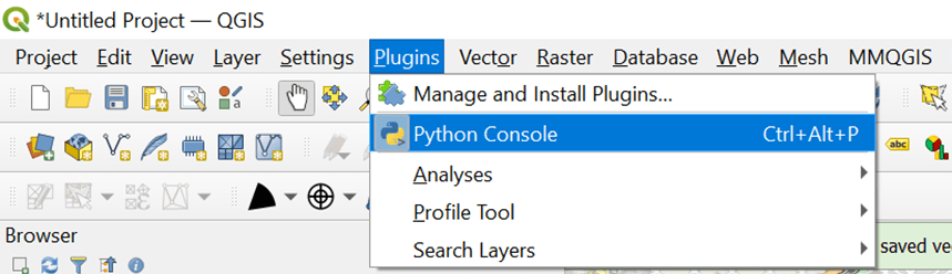
So first we have to do is to go to the top menu and select “Plugins” and then Python Console. Two new windows will opened at the bottom of the screen.
Later I’ll do another post solely on the python console and things you can do with it, but for now we will focus on generating the cell pies. Maybe you noticed already but on the create wedge buffers tool at the bottom of the window there is an advance button. If you click it, you will find an option to Copy as Python Command:
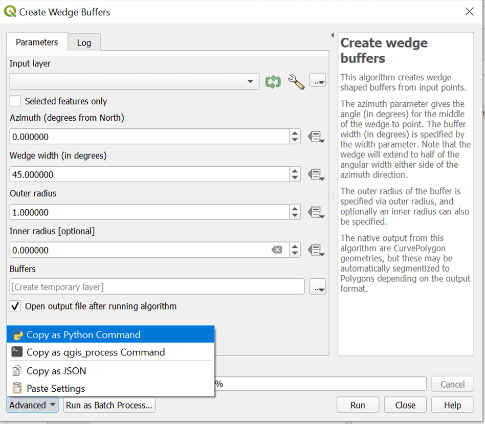
And guess what… yes! you can copy the code and paste it into your python console!
processing.run("native:wedgebuffers", {'INPUT':'delimitedtext://file:///C:/Users/diegogo/Documents/Maps/BuenosAires_cells.csv?type=csv','AZIMUTH':QgsProperty.fromExpression('"Azimuth"'),'WIDTH':QgsProperty.fromExpression('if ("earfcnDL" = 775, 35,50)'),'OUTER_RADIUS':QgsProperty.fromExpression('if ("earfcnDL" = 775, 0.0016,0.0012)'),'INNER_RADIUS':0,'OUTPUT':'TEMPORARY_OUTPUT'})If you are familiar with Python (which I hope, if you are trying to do this) you will notice that there is a dictionary that grabs all the parameters on the wedge buffers function. If you start with csv, there will be a lot of parameters related to your csv file (which I have deleted, for the sake of space). Also the if statements are there and there is an output that points to a temporary output. If you have already paste your code into the python console and hit run, you will notice that nothing happened. And this has to do with the temporary output.
Dealing with vector layers
The output set in the wedge buffer function is saved in the same directory you are setting your input file. We can further modify the output file to an ArcGIS shp type changing a little of our code:
processing.run("native:wedgebuffers", {'INPUT':'delimitedtext://file:///C:/Users/diegogo/Documents/Maps/BuenosAires_cells.csv?type=csv','AZIMUTH':QgsProperty.fromExpression('"Azimuth"'),'WIDTH':QgsProperty.fromExpression('if ("earfcnDL" = 775, 35,50)'),'OUTER_RADIUS':QgsProperty.fromExpression('if ("earfcnDL" = 775, 0.0016,0.0012)'),'INNER_RADIUS':0,'OUTPUT':'OUTPUT.shp'})If you run again this code you will get a new output.shp file in the same input directory. Now all we need is to load the layer so we can visualize it. in order to do so we have to add this little code:
layer = iface.addVectorLayer("/path/to/shapefile/file.shp", "layer name you like", "ogr")With that second line of code your layer will be displayed. There are very interesting things about working on the python console. First of all, you can save the code and call it every time you need to perform this task, saving some time. Also is highly customizable; you can use most of python commands to get the best of it.
I hope you have enjoy this post. If so, go ahead, open your QGIS and have fun!
Cheers!
Diego Goncalves Kovadloff
References
Lucchese, L. V. (n.d.). LUCCHESE, L. V. LUCCHESE, L. V. https://www.luisalucchese.com/
Loading layers. (n.d.). https://docs.qgis.org/2.18/en/docs/pyqgis_developer_cookbook/loadlayer.html

very good info.
i am planning to draw some lines indicating intra-freq handovers (the line sould indicate the destiny neighbor) any idea on how to achieve this ?
thanks
LikeLike
Great project Osvaldo! QGIS has some sort of spider graphs towards neighbors… there should be a way to edit it… Give me some time and I may come with something.
Glad you find useful my post!
Cheers!
LikeLike